Logo


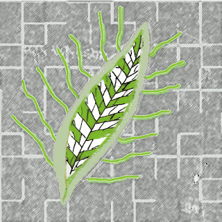
In the IARc 211 class we had an assingment to do a logo for the residential kitchen that we designed for the famous celebrity. This was part of the "So you think you can('t) draw" and we had to do it on a 4"x 4" piece of paper. My concept was leaf and circulation, texture, proportion , line were part of the concept.

Residential Kitchen Project


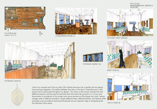
Residential kitchen project in the studio class was due Nov 24 and we had to have the program, specs,perspectives,case study, elevations, sketch book, materials board , and this is the composition board I put together with the perspectives.  Leaf was the concept that it fit my client because she was gentle and her design work portrays elegance. Circulation of the parts in the leaf is important and is portrayed throughout my design. The colors of the leaves change from the different seasons and the way that the leaf falls from the tree to the ground is in a curvy way. Asymmetry is considered in this project and some elements of the design are color (leaves change color in different season), shape (different trees, different leaves),  and texture while principles such as balance and proportion/scale are an important step to recognizing the full potential of the space.  

IARc 222-Navigation of space

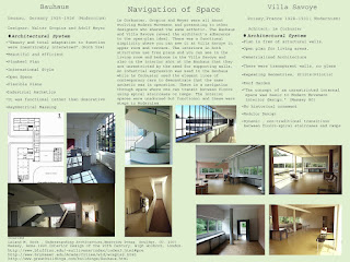
navigation of space
In the history of interior architecture class we had to discuss two structures and how navigation of space works in the interior. Check out the photo for the spaces that I had to compare and contrast.There is many ways of how a designer sees navigation of space. One would reveal the architect's adherence to the open-plan ideal. There could be a functional simplicity, free plans where one could see that these (plans) are unrestricted by the need of supporting walls. In some spaces you could see an industrial expression while on other spaces elegant lines of contemporary cars to demonstrate that the same aesthetic was in operation. there is a navigation through space where one can transit between floors using spiral staircases or ramps. The interiors were unadorned but functional and these were steps to Modernism.  

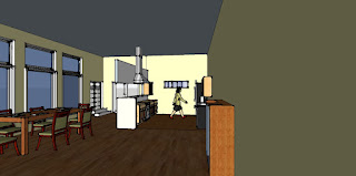
Residental Kitchen:Update

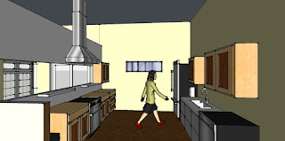
rendering kitchen
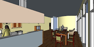
rendering living room

kitchen space,cabinets


In the studio class we had to design a kitchen for a famous Client (Eva Zeisel is my client) and these are the updated perspectives for the kitchen.I worked closely and the renderings were changed and progressed as I was closing down on a single concept. Narrowing down your ideas is easier when you put everything on paper. Try exercises (like put your pen on paper and don't take your hand off, just draw and continue like that for five minutes or so. You will notice a difference on how you approach your sketches and you will not stop till you see different possibilities of how a (design) layout works.)

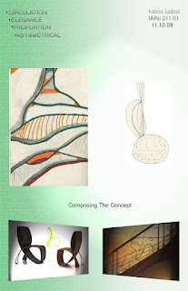
IARc 211: Concept Composition

hand drawing, chair and stairs inspirations
We created a concept composite for the kitchen we are designing for the celebrity in studio ( mine was Eva Zeisel: Industrial Designer). We had to include two precedent images, two large hand sketches and four words that sum-up the concept for the design of the kitchen. I did this composite in Photoshop and it was to turn in on a 11"x17".

IARc Studio 201: Residential Kitchen

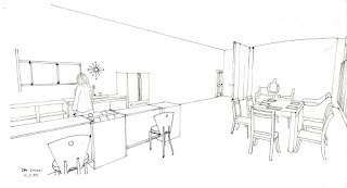
kitchen line drawing black ink pen interior
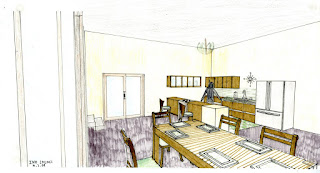
interior rendering kitchen
In the studio IARc 201 (school related project) class we had to design a kitchen for a celebrity client. Eva Zeisel is an industrial designer and she is my client. I started by getting some information and researched and analyzed what was important and seeing what some ideas could work. I look at inspirations. We had to develop a program based on my client's needs and we sketched perspective views for the proposed design. There are more perspectives to come.