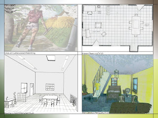
 On an 18" x 24" template we created a composition on Photoshop using the drafted floor plan from project 3, the black-lined perceptive from project 4, and one of the computer enhanced perspectives from project 8. Composing these drawings was not an easy task. I had many drawings and could not decide what to choose for the composite at the moment. I tried different ways and came up with the drawing above. What do you use to create similar compositions?
 Experimenting with Composition
 On an 18" x 24" template we created a composition on Photoshop using the drafted floor plan from project 3, the black-lined perceptive from project 4, and one of the computer enhanced perspectives from project 8. Composing these drawings was not an easy task. I had many drawings and could not decide what to choose for the composite at the moment. I tried different ways and came up with the drawing above. What do you use to create similar compositions?
 Experimenting in Photoshop
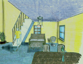 After scanning our perspective drawing, we created three images using a variety of tools on Photoshop and thought about lighting, color, contrast to enhance the perspective. Canvas size is 8.5" x 11". The tools I used on the first drawing are the image adjustments. There I worked with levels, color balance, hue/saturation and texture. Photoshop is a adobe software that it is great in editing ( whether it is photos or creating something completely new). The image adjustment tool is to help the photo (in my rendering) create the right lighting for the atmosphere you want to set on your room ( I worked on the living room drawing). Also, it opens up the colors (cool or warm) and helps portray the shadows a little bit more (I used the color balance tool for this). texture make the photo create a little depth so the photo does not look plain but actual more three dimensional and the materials more accurate. I worked with texture for the ceiling, filters such as
noise for the carpet, clone stamp tool, burn tool and dodge tool for the
shadows. Polygonal lasso tool was used to select different parts of the
perspective.
Do you work with Photoshop? What are some of the tools that you use?
Color Study
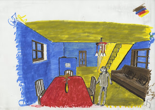
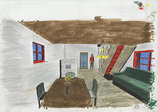
Color Study 1 based on the colors used in Maud Gatewood's painting: “the girl with the red shirt skating on the sidewalk”. Below you will see some iteration that I did inspired by that painting. (If you put the painting description that I wrote above, you will be able to look it up online and see the original painting)

First, one needs the materials in order to complete this exercise.
I used some difference choices of Micron
pens and different pencils. Also, do not forget the markers. Personally, I use
Chartpak’s. I have been using these materials for a while. As I mentioned on my
previous post, I always keep my sketchbook with me and in addition I keep pens
and markers with me because you will never know when you might want to
practice. Maybe you are in front of a beautiful view and to capture the moment
on paper. Maybe you are in a café and want to capture and draw the scene of the
people and the background. Whatever the case might be, it is a great idea to
keep a sketchbook or some papers for you to draw when you are in nature. It is
always a good thing to go out and see the outside and go ahead to capture it.
In Project VII we created four perspectives of the space 14'
x 24' in SketchUp and selected the one we like best. We first started with
SketchUp as a design tool because at the time (and now) and it is a good tool
about getting your schematic design on the computer fast (once you draw some preliminary
ideas on paper). Also, the renderings do not come out bad using podium,
however, they do come out more realistic if you get the VRAY plug-in. The
settings are not that hard to figure out but you need to try different things
and see what works best for you. For the purpose of this exercise that I had to
do at this class, I did more than four perspectives so I could have more
choices and also practice more. It was more for the practice part because I was
just starting out doing more hand rendering so I wanted to get more experience.
There is a lot things to consider when you hand render such as lighting,
materials, different line weights when you deliver the drawings. The
presentation is as much important as what you have put on the paper. We transferred
the SketchUp perspective by hand onto three sheets of 18" x 12" paper
paying close attention to line quality and choice of materials. We chose a
set of four colors based on any one of Maud Gatewood's paintings and rendered
the perspectives. You have to portray the materials as best as you can so
when(if) a customer asks " What materials would you suggest to use in the
space?", you would visually show it with your drawings without actually
describing anything. You would let the drawings do the talking
Perspective drawings : A Second View
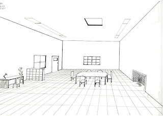
This was the follow up blog of the “Visual design drawings
and construction" post. You should check the visual design series if you
have not read them on my blog yet. One would say these drawings are very simple
and not much stuff in them. Someone else would say ‘the simple it is, the
more one can see’. So what holds true about those two sentences in this
situation. First, you definitely want to show as much possible in the design.
One has to show that details matter. It is the small details that make the most
impact in an architecture design project. Why are
we doing this? One reason of doing designs, whether architectural design or
graphic design (anything in the design field) is about personal achievement or tomorrow,
next week, next month or next year you might want to build your own custom
house.
Visualize design drawings and construction documents
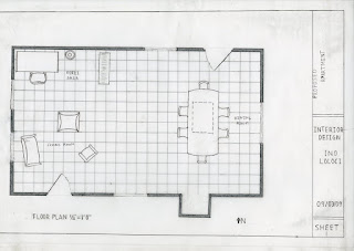
Visual Communication is important. One would ask “Well, Why is this so important?” It is all about how you portray your ideas on paper. Visualization is the image that one creates and describes. One has to find their own design style. Architecture design has many styles that one figures out when they are practicing. You should have design goals to achieve the style you like. That would short term goals and long term goal. Short term goals would be drawing something every day, or at least a drawing/sketch every two days. I would recommend taking your sketchbook wherever you go. Napkin sketches is a great example. If you are at a restaurant and waiting, you should do a design on a napkin. There has also been many napkin competitions that you should check out if interested.
The point of taking the sketchbook everywhere you go is that so you get used to drawing/sketching and achieve your short term design goals that you set.
How to learn hand renderings ,You think you can('t) draw? schematic sketch
After graduating high school I went to a community college
studying Architecture technology. I graduated with an associated degree and
then I transferred to a four-year university studying architecture (interior,
exterior). This is the first assignment that I completed at the four year
school and I posted it on my blog.
The assignment was part of the series called
“ you think you can(t) draw?” and It was about who can draw better, or who can't and see where to improve. Every week
there was a different assignment varying from hand sketches to complete hand
rendering or digital made. Some of the assignments were a mix of both, hand
renderings and digital. I was good with the computer and at the beginning
I was not very good with had renderings.
Subscribe to:
Posts (Atom)
